• Analytics
      Consulting

      Are we a
      Good Fit?

  • Pricing
  • Free Instant Audit
  • Contact Us

How Combining Segmented Data with Screen Recordings Revolutionizes Web Analytics

Contents

Today, we’re diving into something that could completely transform how you understand your website traffic: the integration of segmented data with screen recordings.

We stumbled upon this insight after digging deep into our own analytics and realizing that the tools we were using weren’t providing the full picture. As marketers, we’ve all been there—staring at charts, looking at bounce rates, traffic sources, and trying to figure out why things are happening. What if there was a way to see what users were doing, rather than just interpreting numbers?

Well, there is, and it’s game-changing.

In this blog, we’ll walk you through how combining segmented data with screen recordings can give you the clarity you need to truly understand your user’s behavior—and make smarter marketing decisions.

The Evolution of Screen Recording Tools in Marketing Analytics

A diverse group of marketing professionals in a modern office setting, engaged around a large screen displaying colorful graphs and screen recording footage. A Caucasian woman focuses intently on the graphics, while an Asian man contemplates the data's implications. The atmosphere reflects collaboration and innovation with cutting-edge technology surrounding them.

Remember when screen recording tools first hit the scene? Tools like Hotjar, Crazy Egg, and Mouseflow gave us the ability to actually watch users as they navigated our websites. It felt like magic. Watching someone’s mouse move across the screen was as close to peeking over their shoulder as you could get.

The excitement was real. Finally, we had a way to see what people were doing! But there was one big problem: the sheer volume of data. Watching hundreds, if not thousands, of recordings quickly became overwhelming. Sitting through session after session to glean meaningful insights felt like trying to find a needle in a haystack. Eventually, many marketers (myself included) shelved these tools, turning our attention back to traditional analytics platforms like Google Analytics.

The problem? Traditional analytics can tell us what is happening, but not why. For years, we’ve had to make educated guesses based on traffic data, conversion rates, and other metrics—but the context was always missing.

The "Peanut Butter & Jelly" Effect: Marrying Segmented Data with Screen Recordings

A diverse group of three computer professionals, including a Caucasian woman with brown hair in a bun, a Hispanic man with a trimmed beard, and a younger Hispanic woman with glasses and short black hair, are collaborating intently around a large computer screen displaying graphs, charts, and video clips of user behavior. Their engaged expressions convey curiosity and understanding as they analyze the data together in a dynamic work environment that emphasizes teamwork and innovative discovery.

Then, something clicked—like peanut butter meeting jelly. What if we could combine the power of segmented data with the visual clarity of screen recordings? That’s when things got interesting.

Mike and I started experimenting with integrating screen recording tools into our data reports. Imagine this: you’re able to look at your web analytics and say, “Show me all the people who landed on this page, clicked through to another, and then bounced.” But instead of just seeing numbers, you can watch those exact users’ sessions. You can watch what they did, how they did it, and—most importantly—why they left without converting.

Mike recalls a client that was trying to troubleshoot a major issue with their product’s onboarding flow. They had everything set up—custom tags, tracking for errors, you name it—but still couldn’t figure out why users were dropping off. After weeks of back-and-forth with the engineering team, they tried pairing their analytics data with screen recordings.

By watching real sessions of users navigating the onboarding process, they were finally able to pinpoint the issue—and it wasn’t what they thought. This marriage of data and recordings offered an entirely new perspective, revealing insights they would never have found in the data alone.

Bridging the Gap Between Marketers and User Behavior

A diverse group of marketers, including a Caucasian woman, an Asian man, and a Hispanic woman, gathered around a computer screen displaying abstract symbols related to user session recordings. The background features abstract data charts and analytics on the wall, creating an atmosphere of excitement and collaboration in understanding user engagement.

This is where things get exciting for marketers. Historically, we’ve been at the mercy of data charts, looking at user paths, conversion funnels, and trying to make sense of drop-offs. You look at the numbers and think, “I think I know why they left.” But that’s the problem—you’re guessing.

What if you didn’t have to guess? What if you could see it?

With tools like Mouseflow or FullStory, we now have the ability to watch individual user sessions that match the filters we’re interested in. Maybe you’re seeing a lot of users bouncing off your homepage without engaging. You want to know why, but all you have is a number. Now, with this combined approach, you can actually watch the users who bounced, see where they scrolled, what they hovered over, and what ultimately caused them to leave.

As marketers, we often assume we know what the customer experience looks like. We expect users to follow a linear path—home page to product gallery to checkout. But when you watch these recordings, you quickly realize that user behavior is anything but predictable. And this is where the magic happens. When you watch what actually happens on your site, it completely changes how you approach your marketing strategy.

Why Empathy-Driven Insights Matter

A diverse group of three professionals, a Caucasian male, a Hispanic female, and an Asian male, are intently collaborating around a computer screen in a modern workspace. Their faces express curiosity and empathy as they analyze user experience data. The office features contemporary elements like ergonomic chairs, sleek desks, and modern tech gadgets. The computer screen displays symbols representing user experience recordings, such as play, pause, and rewind buttons along with progress bars, instead of any legible text.

Seeing a user’s journey creates empathy—something that aggregate data alone can’t offer. When you watch a session, you start to feel what the user feels. You ask yourself, “Why did they pause there?” or “What were they expecting to see that wasn’t there?”

Mike shared a perfect example from one of our clients who was running targeted display ads for a niche market. On paper, everything looked great: targeted traffic, good click-through rates, and a solid landing page with a product listing. But after reviewing the screen recordings, we quickly realized something was off. Nearly 100% of users who came in through those ads weren’t engaging with the page at all. Instead, they would land, scroll briefly, and then leave without interacting.

When we showed the client these recordings, it was a lightbulb moment. The data wasn’t enough to explain the issue, but once they saw the sessions, they understood: the user experience was too cold. The landing page wasn’t contextualizing the products, and users felt lost.

This is the power of empathy-driven insights. You can look at data all day, but until you see the user experience firsthand, you’re missing half the story.

Actionable Insights: The True Value of Screen Recording Tools

A diverse group of professionals collaborating in a modern office. A Caucasian woman is focused on her laptop, while an Asian man leans in to analyze the screen. A Hispanic woman points towards the computer display, which shows colorful graphs and symbols representing screen recording analytics. The office environment is sleek and contemporary, emphasizing teamwork and data-driven decision-making.

At AdMind, we have a saying: an insight is something you didn’t know that you can act on to improve performance. The combination of segmented data and screen recordings creates a goldmine of these insights.

You see, traditional analytics tools can only take you so far. You can spot a trend—maybe a particular landing page is seeing high traffic but low conversion. But what then? You’ve identified the issue, but you don’t know why it’s happening. That’s where screen recordings come in. They let you dive into the behavior behind the numbers.

For example, we had a client in the agricultural equipment industry who was sending targeted display traffic to specific product pages. The assumption was that these users were ready to engage with the product list, compare specs, and ultimately find a dealer to visit in person. But when we looked at the data, it showed something unexpected—users weren’t interacting with the product pages at all. The bounce rate was incredibly high.

Now, the old way of thinking would have been to tweak the copy or add more visuals, hoping to improve engagement. But by reviewing the screen recordings, we saw the truth: users were landing on the page and immediately scrolling through without engaging. They weren’t interested in browsing products; they wanted more context. They needed to know why they should care about the products in the first place.

This discovery fundamentally shifted how our client approached their marketing. Instead of just tweaking the existing pages, they revamped their approach entirely. They built landing pages that educated users first, offering context before asking them to dive into product details. And it worked. The engagement numbers shot up.

These kinds of insights are game-changing because they go beyond surface-level assumptions. They reveal why users are behaving the way they are, giving you the actionable data needed to make real improvements.

The Power of Visualization in Hypothesis Testing

A modern office setting featuring a diverse group of marketers, including a focused Caucasian man and an engaged Asian woman, collaborating over their laptops. The screens display graphs and charts, highlighting their data-driven projects. Their expressions convey deep concentration and teamwork, surrounded by a sleek and contemporary office design.

One of the most dangerous traps marketers fall into is relying solely on their gut instincts when it comes to interpreting data. You see a trend in your analytics—maybe a drop-off at a specific point in the user journey—and it’s tempting to immediately jump to conclusions. “Ah, it’s because the form is too long,” or “The call to action isn’t clear enough.” And sure, sometimes you’re right. But more often than not, our intuition doesn’t align with actual user behavior.

That’s where screen recordings come to the rescue.

Instead of guessing, you can watch. You can see how real users navigate your site and where they stumble. This gives you a factual basis to form your hypotheses. No more guessing why conversion rates have dipped—now you have real evidence to guide your decision-making.

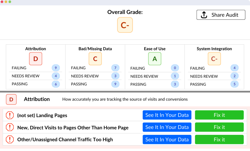
Mike describes a great example from one of our recent projects. We were working on a new feature that allows clients to run a free audit of their Google Analytics setup. It’s a fantastic tool, but we noticed a significant drop-off between users visiting the landing page and completing the audit process. On the surface, the data suggested that users were interested, but something was stopping them from finishing the audit.

Was it a technical issue? Was the form too long? Did users not trust us with their data? We didn’t know. So, instead of speculating, we reviewed the screen recordings.

The issue became clear almost immediately. When users clicked to authenticate their Google Analytics account, they were greeted with a generic authorization page that didn’t explain why we needed access to their data. There was no reassurance about what we would (or wouldn’t) do with their information, and as a result, many users got cold feet and left.

Armed with this insight, we redesigned the page, adding clear messaging that explained what we’d do with their data, why it was safe to authenticate, and how users could revoke access at any time. After implementing these changes, the completion rate jumped.

This is the true power of visualization in hypothesis testing. By watching real user behavior, you build hypotheses that are grounded in reality. And when you communicate these findings to stakeholders, you’re armed with evidence that makes your case stronger and more compelling.

Bringing Marketing Back to Marketers

A diverse group of Caucasian and Hispanic marketers gathered around a table with laptops, engaged in animated discussion. Their expressions convey warmth and creativity, while illustrations of screen recordings are scattered around them. The background features analytics visuals, including charts and graphs, symbolizing the blend of intuition and data-driven strategies in marketing.

Here’s what excites me the most about this whole approach: it puts marketing back where it belongs—in the hands of marketers.

For years, we’ve been buried under charts and spreadsheets, trying to decode what’s happening on our websites. Don’t get me wrong, analytics are invaluable, but they only show us one side of the coin. We’re looking at numbers, not people.

When you integrate screen recordings with segmented data, you get the full picture. You stop looking at your audience as just “traffic” or “sessions” and start seeing them as real people with real behaviors. You start asking the right questions: What are they expecting? What do they want to see? How can I create a better experience for them?

And that’s the key—empathy. Empathy is what drives great marketing. When you can put yourself in the shoes of your users, when you can see how they navigate your site, struggle with friction points, or abandon your funnel, it reignites your creative spark. You stop optimizing for numbers and start optimizing for experiences.

And this is where the magic happens. This is where your creative instincts come to life.

When Mike and I started using this approach, it was like a lightbulb moment. No longer were we limited to optimizing based on the cold, hard numbers. We could now see the user experience and make changes that would have real, lasting impact. And it made us better marketers.

So, if you’re tired of marketing via spreadsheet review and you’re ready to get back to marketing via observation review, it’s time to embrace this new approach. Trust me—once you do, there’s no going back.

Conclusion: Get Insights You Can Act On

A diverse group of Caucasian and Hispanic professionals, both men and women, gather around a laptop in a modern office setting. They are engaged in a team meeting, analyzing charts and screen recordings displayed on the laptop. The atmosphere conveys a sense of teamwork and collaboration as they discuss insights from the data analytics represented on the screen.

At AdMind, we believe in the power of insights—those game-changing realizations that help you improve performance. And the truth is, the combination of segmented data and screen recordings is the ultimate insight generator. It gives you a window into your users’ world, allowing you to act on things you didn’t know before.

If you’re ready to see what this approach can do for your business, we’d love to help. You can schedule a discovery call with us at AdMind Analytics, and we’ll walk you through how this can work for you. You’ll end up talking with me or Mike, and together we’ll uncover new ways to optimize your marketing efforts.

Not quite ready for a full consultation? No problem. Head over to our website and try out our free Google Analytics audit tool. It’ll give you a detailed report on your GA4 setup, pointing out areas for improvement. If you’re curious about the results, we’re happy to chat and help guide you through next steps.

At the end of the day, it’s all about one thing: finding insights you didn’t know that you can act on to improve performance. And we’re here to help you do just that.

Share:

Ready to see how proper analytics can drive growth for you?

"*" indicates required fields

This field is for validation purposes and should be left unchanged.

Free Instant GA4 Audit

GA4 Audit Tool

Insights in 90 Seconds

  • Test over 70 collection issues
  • See your data benchmarked
  • Video explainers of causes and solutions
  • Get a taste of working with our team
  • How do you stack up?
GA4 Audit Tool

Free Instant Audit!

  • 70+ tests in less than 90 sec.
  • Industry-specific video advice
  • A sample of the adMind experience